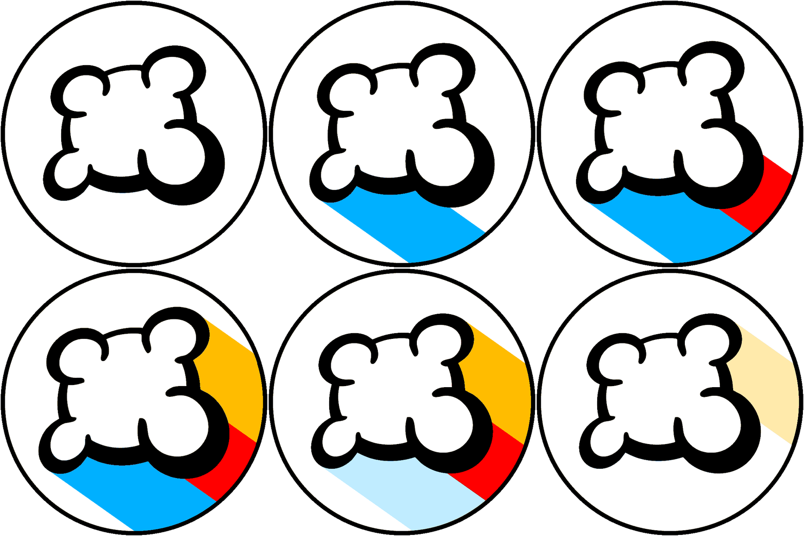
UPDATE : April fool's! Of course it was a joke, except one thing: we care about YOU, who used to like this website despite its weakness and "not so good looking" stuff. But to make this service sustainable and even larger, we also need the audience that is NOT coming today on BGA because of these "details", so we have to care about eye candy things too. This is a challenge to satisfy all audiences, but we like this 🙂 Last summer, we changed entirely the visual universe of Board Game Arena with a new logo and new colors. However, for nostalgic reasons and other reasons explained below, we decided to move back and restore our previous logo & colors. The main reason is the following : Een and I, the main facilitators of this service, are both engineers, with an artistic sensibility close to zero. Making "good looking" stuff, "nice" colors, "visual harmony", all these things, well ... this is not really our cup of tea. When we started this website, we went straight to the important point : efficiency. Need an additional statistics ? Here we go : push this button a little bit to the left, push this other element a little bit to the right, and put the new stat in the middle. Need a new advanced option? No problem at all, we add it and add it two others by the way. So yes, at the end the results looks like the Space Shuttle cockpit, but after all, we are board games players and we like to give ourselves headaches ! So yes, they may have good reasons to make this website more "accessible", to have a "wider audience", but to be honest : we only care about YOU, who is already there and who is there and have been always there. You don't care about "raw" interfaces, you are not afraid about juggling with tons of options. And by the way, we are close to 800.000 registered users on BGA, this is good enough 🙂 ! In consequence, in the near future we will revert some changes from last years. What you can expect is to see everywhere more buttons, more options, more indicators ... and you won't need to click to make them appear. On mobile, to make things clear you'll just have to zoom a little (at 800% everything is pretty clear). So yes the website may be a little bit more complex than today, but we are now writing a very simple PDF with a dozen of pages to explain how all of this will work. Like a BGA game rules. Simple and efficient. Of course, the new-old logo symbolize this first step of this direction change. In the following weeks you'll see other changes, and we hope that this will allow you to go further with BGA, for the love of board games, only board games, without eye-candy stuff - after all, why not play in text mode? The team.
愚人节︰ BGA LOGO︰ 返璞归真
更新︰ 愚人节快乐 !
当然这是个玩笑,除了一件事︰ 我们铭记曾经喜欢这个网站的你,尽管当时它有一些弱点和"不太好看"的东西。
但要使这项服务持续发展,不断扩大,我们也需要今天因为这些"细节"离开BGA的玩家,正因如此我们需要考虑让BGA变得更“养眼”。
满足所有玩家是一个挑战,但我们喜欢接受挑战。
![]()
去年夏天,我们完全改变了BGA,使用了新LOGO和颜色。
然而,出于怀旧和如下原因,我们决定恢复以前的LOGO和颜色。
最主要的原因是: Een与我,这项服务的主要合作者,是两个工程师,艺术感性接近于零。
制作"好看"的东西,"漂亮"的色彩,"视觉和谐",所有这些东西,等等...
这真的不是我们的爱好和特长。
当我们开始这个网站时,我们只考虑了重要的一点︰ 效率。
需要额外的统计?
让我们开始吧︰ 把这个按钮向左挪挪,把这个按钮向右挪挪,在中间放上新的统计。
需要一个新的高级选项吗?
没问题,顺便再加上其他两个吧。
所以,虽然结果看起来像航天飞机驾驶舱,但毕竟 我们是桌游玩家,而且我们想让自己头痛!
所以,反对者可能有充分的理由,宣称本网站应该更"容易",来获得"更多的玩家",但老实说︰ 我们只在乎你们这些过去和现在的玩家。
你不在乎"原始"的UI,你不在乎成吨的选项。
顺便说一下,我们有将近800000的BGA注册用户,这够多了
![]() !
因此,在不久的将来我们将还原一些过去几年中进行更改。
你将会看到更多的按钮,更多的选择,更多的指标......
!
因此,在不久的将来我们将还原一些过去几年中进行更改。
你将会看到更多的按钮,更多的选择,更多的指标......
你不需要单击使它们出现。
在移动端,你只需要稍稍放大来看轻它们(800%就很清楚啦)。
所以,这个网站可能比今天稍稍复杂,但我们现在正在编写非常简单的几十页的pdf来解释这一切将如何进行。
像一个 BGA 的游戏规则,
简单而高效。
当然,新的旧LOGO象征着这个战略转向的第一步。
在接下来的几周,你会看到其他的变化。我们希望,这将允许您去在BGA更进一步,凭借对桌游的热爱,仅有桌游,没有诱惑眼睛的东西 — — 说真的,为什么不进行文本模式的游戏?
开发团队。

